The dual scale chart: a tool to analyze the prices of purchased materials
New data visualization feature in PricePedia
Published by Pasquale Marzano. .
Strumenti Analysis tools and methodologies PricePedia now includes a new dual scale feature in its charts, integrating the innovations introduced in 2024[1].
The dual scale (or dual-axis chart) is a data visualization technique that allows the representation of two data series with different magnitudes on a single chart by using two vertical axes: one on the left and one on the right. This technique can serve as an effective tool for analyzing price relationships with varying degrees of variability, especially useful when examining correlations between variables like the price of a product and the cost of its raw materials. In such cases, the dual scale enables simultaneous visualization of both variables, highlighting similarities, divergences, or potential price transmission delays along the supply chain.
Do you want to stay up-to-date on commodity market trends?
Sign up for PricePedia newsletter: it's free!
Below are some examples of dual-scale usage.
Relationship between metals and minerals
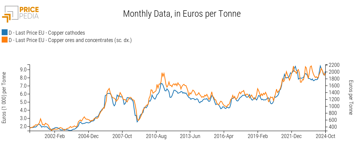
The chart below compares the price of copper cathodes (left scale) and copper ores (right scale), both expressed in euros per ton.

In this case, the dual scale highlights the close relationship between ore costs and copper cathode prices, bridging the gap created by the two price levels. It can be observed that the two products' prices follow a similar long-term trend, although short-term deviations can occur. An example is the rise in ore prices in the second half of 2023, which was not matched by a rise in copper cathode prices. Another notable aspect is that, in some periods, ore prices tend to lag behind cathode prices instead of leading them, as would be expected based on the production process. One possible explanation for this phenomenon is the presence of a financial benchmark, the copper price listed on the London Metal Exchange, which influences price dynamics in physical markets.
The thermoplastics supply chain
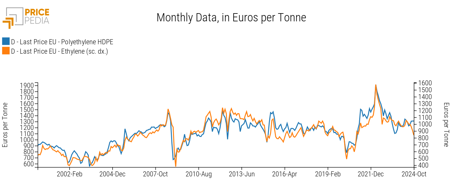
Another example of relationships along the same supply chain is between polyethylene and its monomer, ethylene. The chart below compares the price of HDPE (left scale) and ethylene (right scale), both expressed in euros per ton.

Here again, the strong correlation between the monomer and polymer is evident. Moreover, the polymer shows greater variability: for instance, the increase in the first part of 2021 and the subsequent decline in 2023 were more pronounced than those observed for ethylene.
Comparison of prices across geographic regions
A final example is the comparison of natural gas prices across three geographic regions: TTF natural gas (left scale), the benchmark for the European market; JKM LNG (left scale), the benchmark for the Asian market; and Henry Hub natural gas (right scale), the benchmark for the North American market. Prices are expressed in euros per MWh. This example includes two charts: one on the left using a single scale and one on the right with dual scales.
Comparison with single scale

Comparison with dual scale

The chart on the left highlights the differential between Henry Hub natural gas prices and the other two benchmarks. However, this makes it difficult to graphically discern the relationship between the three prices, while the strong correlation between TTF and JKM natural gas prices is apparent.
The chart on the right, using dual scales, makes the correlation between the three geographic prices more evident. Specifically, it shows how the shocks that hit the European and Asian markets in 2022 generated similar dynamics in the U.S. market. Thanks to the dual scales, the chart also reveals how the U.S. price has returned to levels close to the 2014–2021 average, whereas prices in the other two markets remain higher than in the same period.
Conclusions
The value of data lies in the information that can be extracted from it. Recent advances in artificial intelligence algorithms allow for insights that would otherwise be inaccessible, especially when analyzing large datasets (Big Data). However, traditional tools like statistical analyses and econometric models remain fundamentally important.
Among these established tools, data visualization plays a key role in facilitating understanding of the relationships between different price levels and dynamics. In this context, the introduction of dual-axis charts in PricePedia enhances the already available visualization capabilities. This new feature enables more immediate analysis of price trends along supply chains and across different markets.
1. In 2024, new transformations like centered moving average, cumulative moving average, and deflation were introduced.


